Piano keys have been black and white for centuries (it all seems to have started with the harpsichord), and it is fair to say that when people imagine pianos, they think about black and white keys.
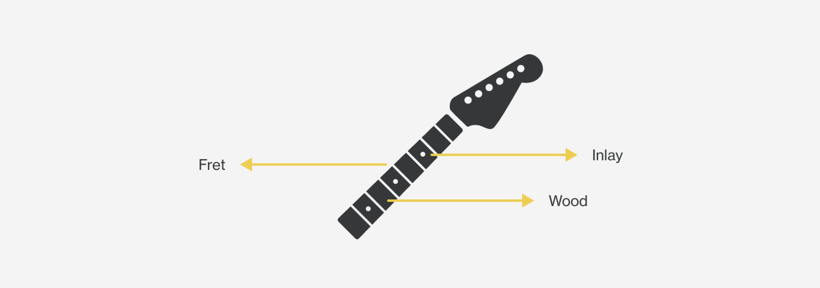
When thinking about a guitar, people don't have the same clear and consistent picture of its neck colors, except that it is made of wood with inlays and frets.
One of these days, when switching between playing guitar and piano, I noticed a big difference in visual contrast between these instruments and wondered how much this fact could impact learning how to play. I then decided to do a quick experiment to verify my thinking.
Disclaimer: This post is purely a fun investigation and does not aim to have scientific conclusions.
The Experiment
Even though this was just a fun experiment, I relied on the basics of the scientific method: (1) observation → , (2) hypothesis → , (3) test → (4) conclusion. In addition, I adopted digital product design concepts such as learnability and contrast ratios since it was a familiar language.
Hypothesis
The higher the neck materials contrast, the easier it could be to navigate through the guitar's fretboard, positively increasing the learnability of new musical pieces when reading sheet music or general practice around fretboard visualization.
Definitions
Learnability
Alita Joyce defines Learnability as "how easy it is for users to accomplish a task the first time they encounter the interface and how many repetitions it takes for them to become efficient at that task." 1. Applying that to guitar, it could look like "how easy it is for a musician to execute a lick the first time they encounter the transcription."
Contrast Ratio
Contrast is the difference in luminance or color between juxtapositioned or close objects 2. The higher the difference, the easier it is for your eyes to notice it. We shall keep in mind three elements for guitar necks: the wood, the inlay, and the fret.
The Interface: the guitar neck
Contrast Analysis
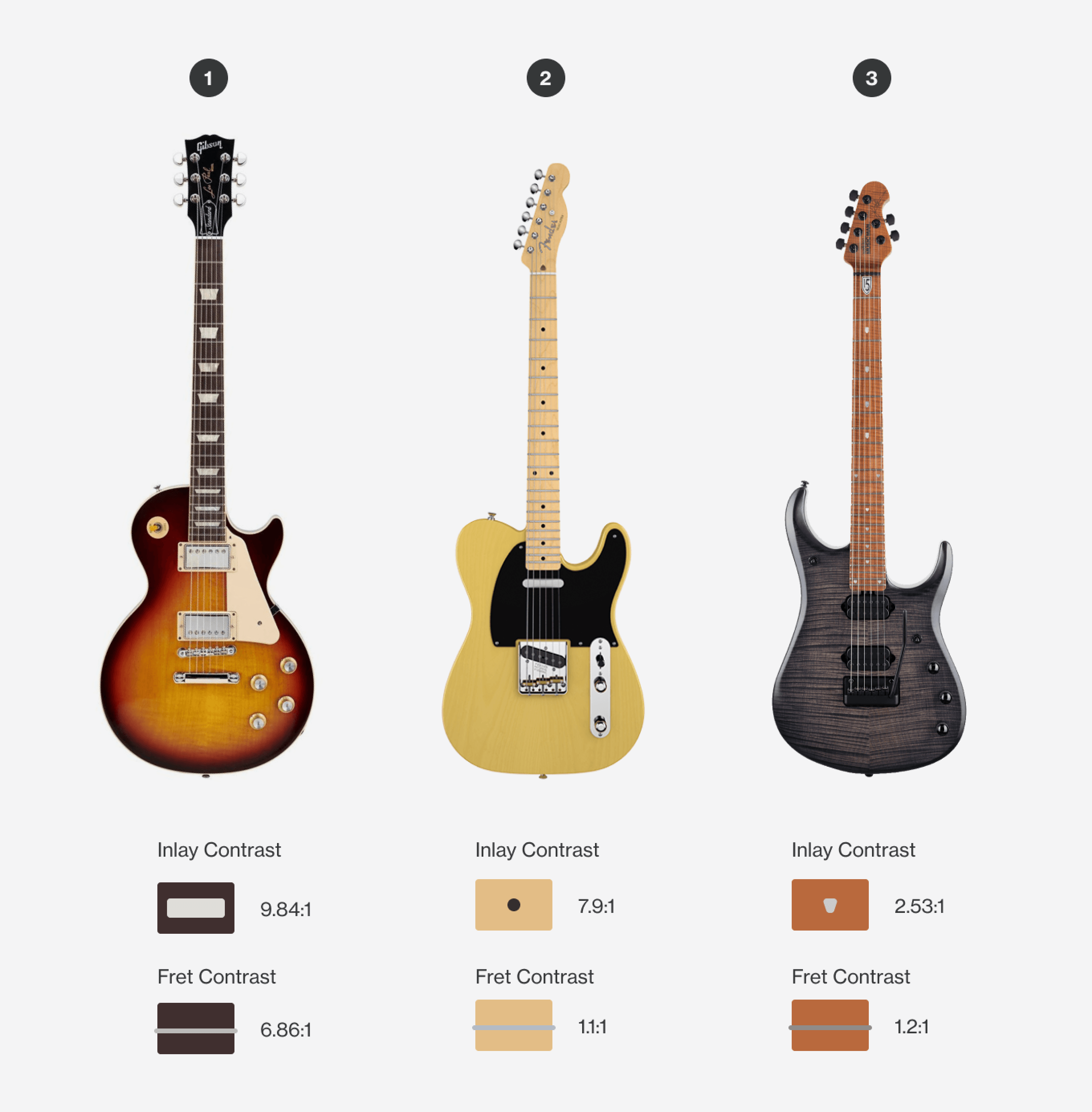
For the contrast analysis, I used pictures from manufacturers' websites and selected three models that presented noticeable tone differences in a first look. I then used a simple web contrast checker to check the values. I compared Inlay to Wood and Fret to Wood contrast ratios and ranked the selected instruments based on the results of the two numbers. One caveat is that natural wood doesn't usually have a 100% flat tone. The process of picking color wasn't 100% accurate, nor was it meant to be.
The Test
I was privileged to be able to pick from different guitars to entertain me on this experiment. After the initial contrast measurements, I compared the two that had the largest differences in contrast ratio: (1) and (3) in the image above. For two non-consecutive days, I focused on learning two different licks, one on each guitar, noting any differences in my experience. I intentionally skipped one day to understand any noticeable difference in recalling the licks after the first day of exposure.
Conclusions
While this experiment never aimed to prove causation, it was easier for me to learn the lick on guitar (1), as I initially expected. This suggests that neck contrast correlates with how easy it is to learn new licks and that higher contrast necks may help beginners navigate the fretboard more efficiently.
This investigation helped me better understand why professional musicians tend to customize their instruments over time. We could say that custom instruments are a way of maximizing learning and performance. Purely aesthetic upgrades will not necessarily make someone a better musician. Customizations should focus on achieving the proper fit between fingers/bodies and instruments.